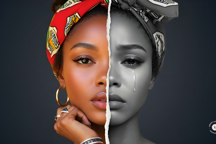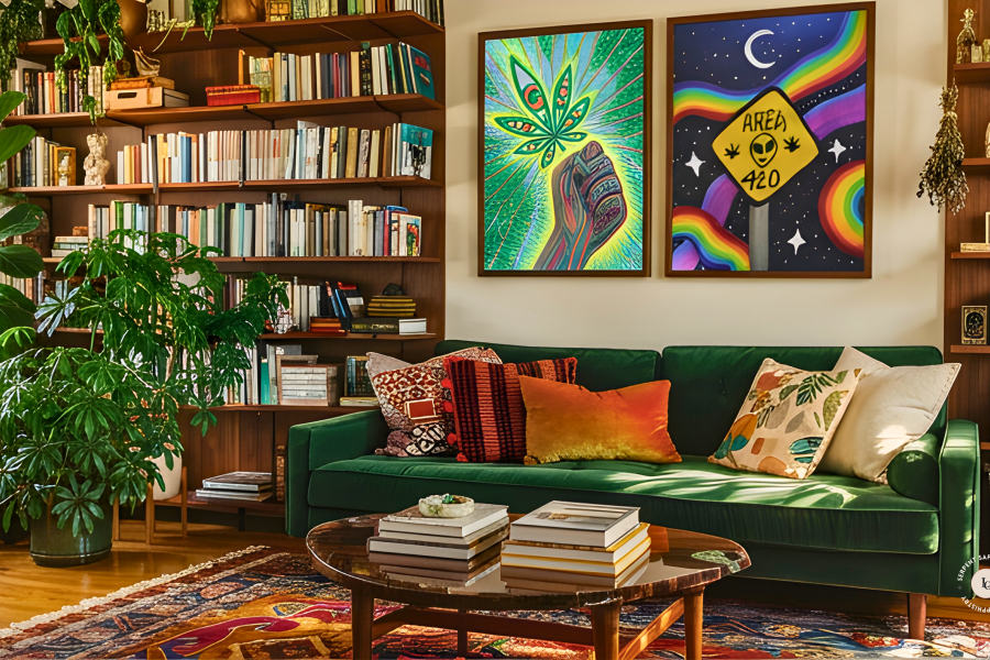

Color is not decoration. It is an expression.
Different cultures interpret colors in many ways, and these cultural connections shape how we see them, often without us realizing it. For me, yellow means courage, happiness, hope, and caution, while gold suggests wealth and prosperity. Others might see yellow as a symbol of death, mourning, or jealousy. Most of these associations work quietly in the background of our minds.
Personal memories add another layer. If your grandfather loved orange and is no longer here, you might feel a strong connection to that color because it reminds you of him. You might use it to honor your ancestors, or you might find yourself drawn to it without knowing why.
If I’m being honest, I mostly wear black, but at home I choose colors carefully. I use them to create moods that shift with the seasons and how I feel each day.
Before we talk about the colors, let’s define two important terms:
Biopsychology examines the relationship between the body and the mind, and how each shapes the other.
Metaphysical refers to our relationship with intangible energies that extend beyond physical reality: spiritual forces, astral realms, and the interconnectedness of living things.
With that grounded, we can begin.
The Primary Colors
Red (with a hint of pink)
Red has a strong physical effect, thanks to its fiery quality. Lighter shades, like pink, can be soothing. They gently lower your heart rate, bring comfort, and create warmth. Darker reds do the opposite: they accelerate the heart rate and can trigger a fight-or-flight response.
Red is often associated with impulsiveness and urgency, leading people to act quickly rather than think things through. Studies show it can boost appetite and sexual desire, especially as the color gets deeper or brighter. This is why red is used so much in stores; hungry shoppers tend to make quicker choices.
Red can help you tap into your inner strength or bring out a sense of attraction. Pink, on the other hand, is calming and nurturing. It’s great for times of stress or when you want to practice self-love.
In metaphysical practice, red aligns with the fire element and the root chakra, embodying physical strength, vitality, courage, passion, and the desire for stability. Pink resonates with friendship, familial bonds, and platonic affection.
Blue
Blue is known for being calming. It brings to mind open water, stillness, and space. Whether bright or dark, blue helps with thinking and communication. Stronger blues keep your mind sharp, even when you’re stressed, while softer blues help you relax.
While red can make you hungrier, blue tends to have the opposite effect. It calms the body and helps you focus. Blue is seen as the least appetizing color, which is why some dieting tips suggest using blue plates.
I often surround myself with blue, whether through objects or jewelry, especially when I write. The color keeps my mind engaged and alert, without ever overstimulating me.
In metaphysical practice, blue aligns with the water element and the throat chakra, governing communication, healing, and reconciliation.
Yellow
Yellow is a strong mental booster. It helps you think clearly, sparks creativity, and lifts your mood. If you’re feeling down, adding yellow to your clothes or space can gently brighten your outlook and change the feel of your surroundings.
The exact shade of yellow makes a difference. Greenish-yellow can remind people of sickness. Soft, warm yellows feel playful and calming. Bright neon yellows are energizing and almost electric.
In metaphysical practice, yellow aligns with the air element and the solar plexus chakra. Its correspondence spans joy, prosperity, and change. It is also considered the color of scholars, associated with study and the pursuit of understanding.
The Secondary Colors
Green
Picture yourself standing under a canopy of trees, sunlight filtering through the leaves, with open fields stretching out ahead.
Green is special because it’s the easiest color for our eyes to see, and science backs this up. It’s gentle and calming, helping us feel well and at peace. When life feels chaotic, green helps us reset and reconnect with nature.
The shade of green matters, too. Blue-green tones can help you think more clearly. Lime green is exciting, while deep forest greens are calming and restorative.
In metaphysical practice, green aligns with the earth element and the heart chakra. It corresponds with nature spirits, healing, balance, growth, and new beginnings.
Orange
Orange combines the energy of red with the warmth of yellow. It’s playful and creative, often associated with curiosity. I enjoy orange in my space for these reasons.
In metaphysical practice, orange is associated with the sacral chakra and the element of fire. It supports creativity, emotional expression, confidence, and sensuality. Orange can help you find new opportunities, motivation, and the drive to create.
Orange Calcite and Orange Carnelian are useful for working with this energy if you incorporate crystals into your daily life.
Purple
Purple blends the clear thinking of blue with the energy of red. This mix creates a color linked to luxury, mystery, and spiritual depth.
Purple serves as a gateway, guiding you to a higher level of awareness. It’s useful for divination, rituals, and exploring magick. Wearing purple can enhance your sensitivity to intuition and strengthen your connection with the spirit world.
In metaphysical practice, purple carries dual correspondence. Indigo aligns with the third eye chakra, governing intuition and psychic alignment. Violet aligns with the crown chakra, governing spiritual growth and connection to universal consciousness. Both draw on the spirit element.
Purple has long been linked to royalty and authority. In this way, it can remind you to take ownership of your own power.
Shades of light
Black, white, and grey aren’t part of the usual color spectrum. They show the extremes and the middle of the light spectrum. How they affect us depends more on our personal experiences and culture, so it’s important to think about what they mean to you.
Set aside what you have been told these shades mean. And instead, think about what they actually stimulate for you and why.
Black
Black embodies a range of powerful energies, including internal reflection, absorption, dominance, and protection.
It acts as a strong ally when seeking breakthroughs and functions as a shield against negative influences, offering control and clarity during uncertain times.
The shade black can repel and banish unwanted energies while revealing hidden truths, making it especially useful in practices like scrying.
White
White represents a range of qualities from cleansing and purification to filling spaces with peace, calm, and reverence.
As the combination of all colors, white is a universal symbol of enlightenment, providing a blank slate for spiritual growth and transformation.
Grey
Grey sits between black and white. It helps with spirit communication and balances energy, offering a sense of neutrality. Grey is good for reflection and for times when you’re still figuring things out.
A Final Note
Colors and shades truly affect our feelings, how we work, and our sense of balance. But it’s important to use them in moderation. Focusing too much on one color can backfire. Too much blue can feel cold, too much purple can make you withdraw, and too much yellow can go from uplifting to overwhelming, causing anxiety instead of clarity.
The spectrum exists for a reason. Use it.
Until Next Time,
Leona 🧿